Project Summary
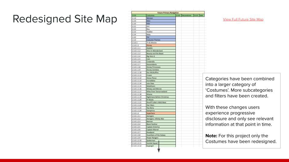
I redesigned the information architecture of Spirit Halloween's online retail store to make it easier for customers to find a Halloween costume. I focused on streamlining the shopping process by consolidating categories, removing redundancy, and allowing customers to filter their options using more variables.
Background
Problem
Spirit Halloween is a retail store that sells Halloween costumes, accessories, and decor. They have over 1,100 seasonal brick and mortar stores across the US and Canada and a year-round online store. When customers shop on their online web and mobile sites the current information architecture creates an overwhelming experience due to the vast number of choices and limited filtering options.
My Role
Information Architect and UX Designer
I worked individually on this project. My work included reconstructing the site map and prototyping a new menu and filter design.
The Process
Methodology
Our research and design process included the following:
– Recreated the current site map in Excel
– Conducted a competitive analysis of online Halloween costume retailers
– Redesigned the site map for the ‘Costumes’ product category, filters, primary nav, global utility, and footer in Excel
– Created high-fidelity prototypes of redesigned web and mobile (Android) experience in Figma using design principles and best practices
Challenges and Limitations
Time constraints prevented me from conducting user research of the current Spirit Halloween site map (tree test and/or card sort) and redesigning other product categories (‘Decorations’ and ‘Sale’).
Deliverables
The project deliverables included:
– Current site map
– Redesigned site map
– A high-fidelity prototype of the redesigned web and mobile experience
– A presentation to showcase the design decisions behind the redesign
Result
A redesigned site map and high-fidelity prototype of the web and mobile experience were created to communicate information architecture and design improvements of the current site.
Improvements included:
– Entry points were reduced to streamline the user journey
– Large categories were broken down into subcategories to improve scannability
– Redundant wording was removed in categories to give users less to process
– More filters were added to help users quickly narrow the list of items, instead of reviewing multiple pages
Next Steps
If I were to continue the project I would do the following:
– Conduct tree testing to validate the proposed new site map
– Depending on the results from the tree test conduct a card sort and make adjustments accordingly
– Update the prototype with any changes in the site map
– Conduct usability testing of the prototype to determine what design changes must be made
Sample of Work
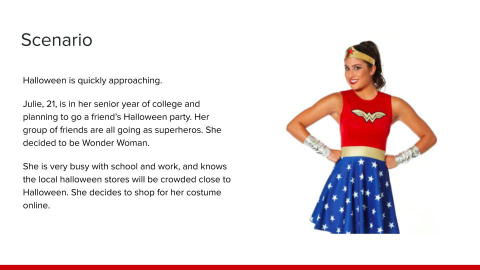
User scenario
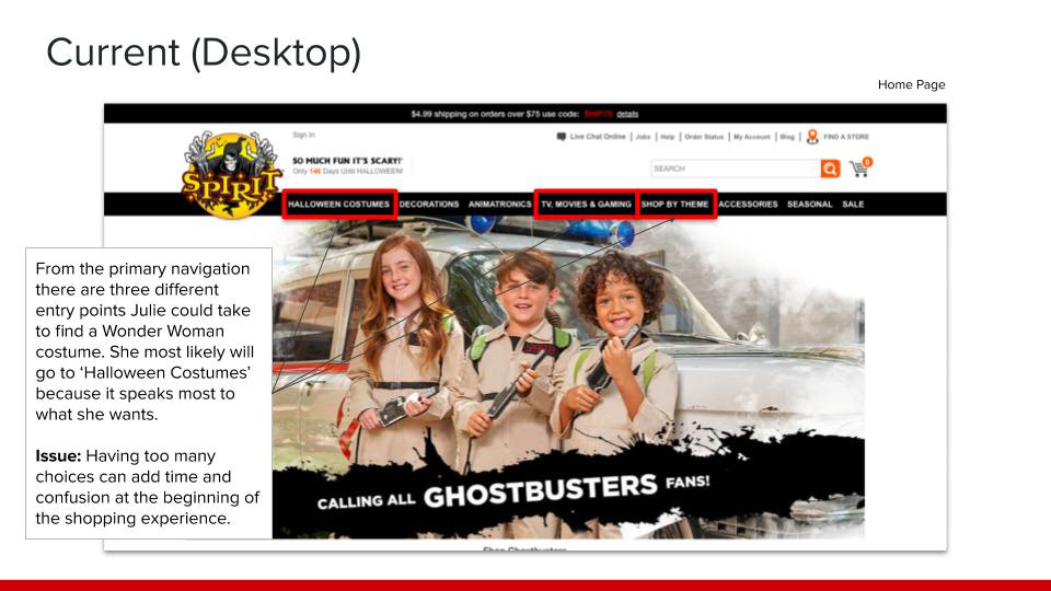
Current primary nav
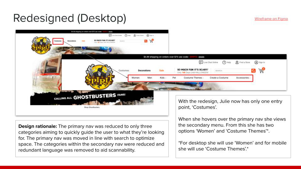
Redesigned primary nav
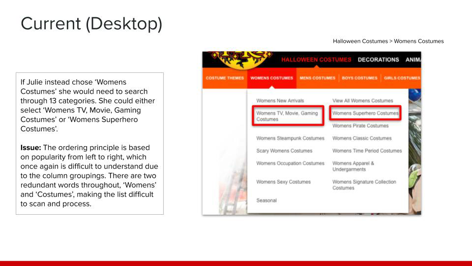
Current navigation for Womens Costumes

Current Womens Costume product page
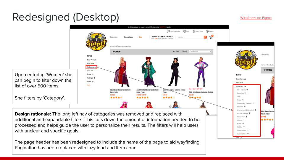
Redesigned Womens Costume product page

Current mobile navigation for Costume Themes
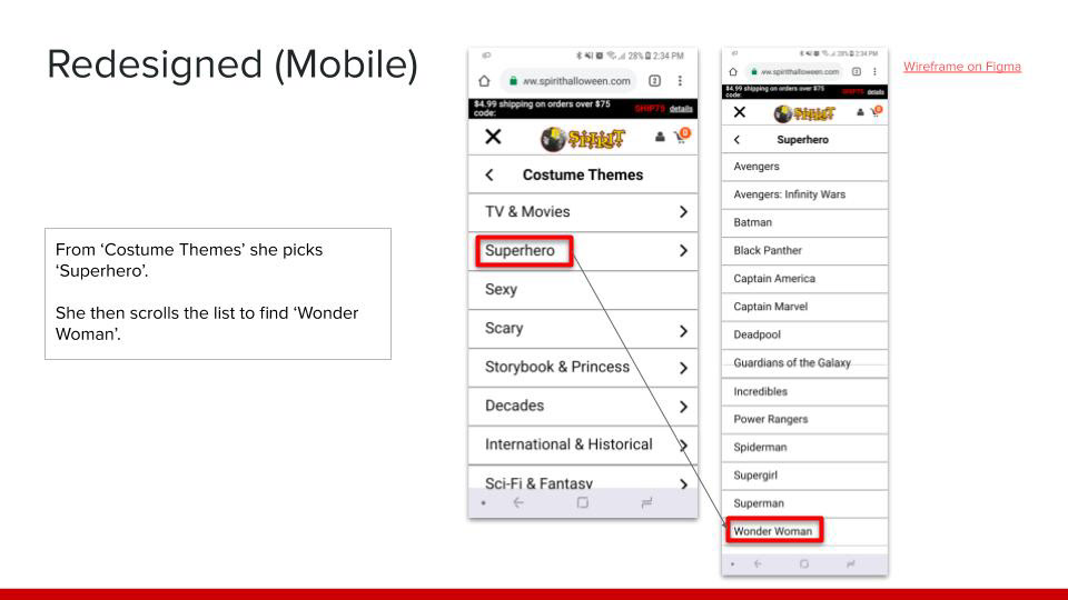
Redesigned mobile navigation for Costume Themes
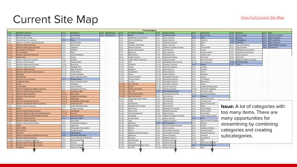
Current site map
